Creating Stunning Visualizations for Decision Trees with dtreeviz
Written on
Chapter 1: Introduction to Decision Tree Visualizations
Decision trees are among the most transparent and interpretable models when it comes to understanding machine learning algorithms. Each decision tree can be articulated as a series of understandable rules. Effective visualization of these models plays a crucial role in enhancing model explainability, allowing stakeholders and business leaders to trust the outcomes produced by these algorithms.
Fortunately, the dtreeviz library simplifies the process of visualizing and interpreting decision trees. In this guide, I will walk you through how to utilize dtreeviz for visualizing both regression and classification tree models.
Section 1.1: Setting Up dtreeviz
To get started with dtreeviz, you can easily install it using pip. Run the following command in your terminal:
pip install dtreeviz
For a comprehensive list of dependencies and any additional libraries that might be required based on your operating system, please check the corresponding GitHub repository.
Section 1.2: Visualizing Regression Trees
In this section, we will train a decision tree regressor using the diabetes dataset. You can find all the code for this tutorial in the provided GitHub repository. I am using Jupyter Notebook as my development environment.
Importing Necessary Libraries
To kick things off, I imported a few essential libraries, including the DecisionTree modules from scikit-learn and dtreeviz:
import numpy as np
import pandas as pd
from sklearn.tree import DecisionTreeClassifier, DecisionTreeRegressor
import dtreeviz
Loading the Data
The diabetes dataset is accessible through scikit-learn. The following code snippet demonstrates how to load the dataset and store the features and target values into numpy arrays named X and y:
from sklearn.datasets import load_diabetes
diabetes_data = load_diabetes()
X = pd.DataFrame(data=diabetes_data['data'], columns=diabetes_data['feature_names'])
y = diabetes_data['target']
Training the Decision Tree Model
To make the tree more manageable for visualization, we can set a maximum depth for the decision tree and train it on the dataset:
dtree_reg = DecisionTreeRegressor(max_depth=3)
dtree_reg.fit(X, y)
Visualizing the Decision Tree
One of the standout features of dtreeviz is its ability to create visually appealing representations of decision tree models. The following code generates a visualization that also indicates decision boundaries at each node:
viz_model = dtreeviz.model(dtree_reg,
X_train=X, y_train=y,
feature_names=list(X.columns),
target_name='diabetes')
viz_model.view()
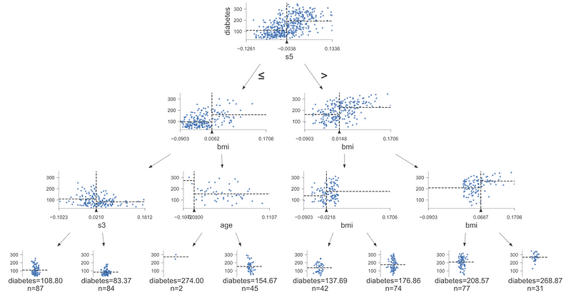
The visualization above provides insight into the decision boundaries and feature space at each node, along with regression outputs and sample sizes at each leaf.
Visualizing Leaf Distributions
Another valuable function provided by dtreeviz is the ability to depict leaf distributions. The leaf nodes contain the predicted values depending on different conditions. We can visualize this using the rtree_leaf_distributions function:
import matplotlib.pyplot as plt
from mpl_toolkits.mplot3d import Axes3D
%matplotlib inline
viz_model.rtree_leaf_distributions()
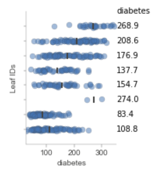
The visualization displays possible predictions for the diabetes target variable. The scattered points indicate the distribution of values, while the small black line signifies the average value utilized for predictions at that leaf. Ideally, leaf distributions should exhibit low variance to boost confidence in the average predictions.
Visualizing Leaf Sizes
We can also create a visualization of the sizes of the leaves, which represent the number of samples at each leaf node:
viz_model.leaf_sizes()
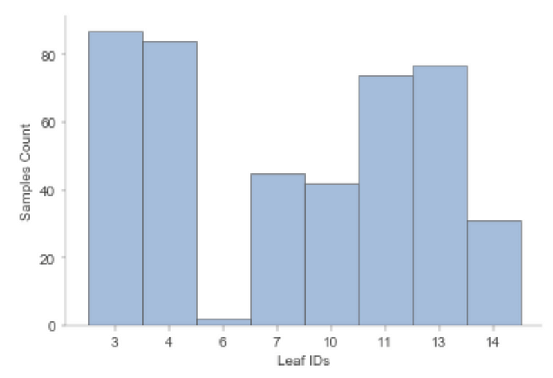
The plot illustrates the number of samples at each leaf, providing a tool for assessing the reliability of regression tree predictions.
Chapter 2: Visualizing Classification Trees
Using dtreeviz, we can also visualize classification trees, although the resulting visualizations differ slightly from those of regression trees. In this chapter, we will train and visualize a decision model using the Breast Cancer Wisconsin dataset.
Loading the Data
The Breast Cancer Wisconsin dataset can be easily accessed via scikit-learn:
from sklearn.datasets import load_breast_cancer
cancer_data = load_breast_cancer()
X = pd.DataFrame(data=cancer_data['data'], columns=cancer_data['feature_names'])
y = cancer_data['target']
Training a Decision Tree Model
Training a decision tree classifier with scikit-learn is straightforward. We can also set a limit on the maximum depth for easier visualization:
dtree_clf = DecisionTreeClassifier(max_depth=4)
dtree_clf.fit(X, y)
Visualizing the Classification Tree
We can utilize the same function from the regression tree section to visualize the classification tree, though the visualization will appear somewhat different:
viz_model = dtreeviz.model(dtree_clf,
X_train=X, y_train=y,
feature_names=list(X.columns),
target_name='cancer')
viz_model.view()
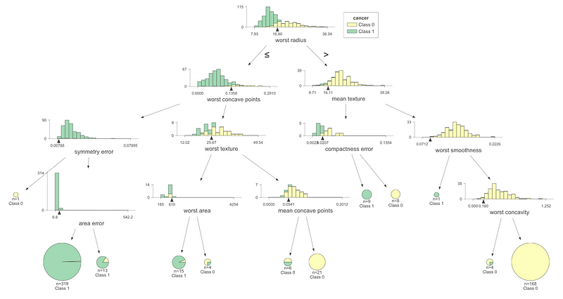
The visualization for the classification tree diverges from that of the regression tree; instead of scatter plots, we see colored histograms that represent class distributions at each node.
Visualizing Leaf Distributions
We can also visualize the class distributions for the leaves using a similar function as before:
viz_model.ctree_leaf_distributions()
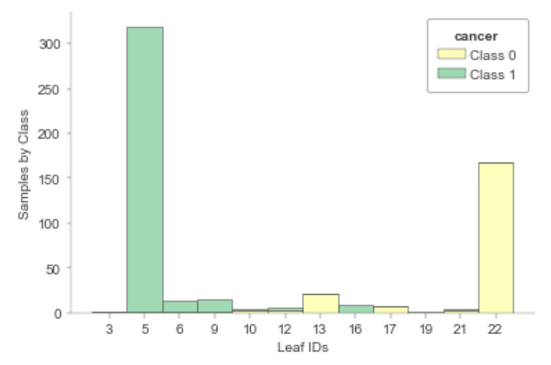
Each leaf corresponds to a stacked bar graph depicting the distribution of class labels for the samples at that leaf. Most leaves show a predominant class, instilling confidence in the model’s predictions.
Visualizing the Feature Space
Lastly, we can visualize the feature space of the classifier:
viz_model.ctree_feature_space()
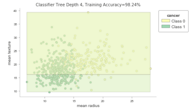
The feature space plot displays the training accuracy of the classification tree, alongside a scatter plot of two features and a linear decision boundary for class separation.
Summary
In summary, dtreeviz is a powerful library for visualizing tree-based models. This guide covered a selection of its visualization capabilities, but many more features await exploration in the dtreeviz GitHub repository. All code snippets from this article can be found in my GitHub as well.
Join my Mailing List
Join my mailing list for updates on data science content. Sign up to receive my free Step-By-Step Guide to Solving Machine Learning Problems! You can also follow me on Twitter for content updates and consider joining the Medium community to access articles from numerous other writers.
Sources
Terence Parr, dtreeviz: Decision Tree Visualization, (2023), GitHub.
The first video, "Best way to Visualize a Decision Tree using dtreeviz," offers a comprehensive overview of utilizing the dtreeviz library for decision tree visualization.
The second video, "Awesome Decision Tree Visualization using dtreeviz library," showcases exemplary techniques for visualizing decision trees with this powerful library.