Effective Badge and Streak Design: Enhancing User Engagement
Written on
Chapter 1: Understanding App Badges and Streaks
App badges and streaks are common features in many applications, but they often fall flat due to poor execution. These elements are not new or revolutionary; in fact, they can feel outdated when not designed thoughtfully. This discussion will focus on how major platforms like Grammarly, Blinkist, Headspace, and Agoda approach these features.
Section 1.1: The Grammarly Example
Grammarly is a tool many depend on for grammar checks, acting as a helpful second pair of eyes for their writing. To foster motivation and encourage regular use, Grammarly introduced a streak feature, which facilitates weekly emails about user engagement. For a deeper dive into this streak functionality within Grammarly, refer to my detailed analysis.
Section 1.2: Accessibility Challenges
Grammarly operates effectively on both mobile and desktop platforms, yet its badge and streak features lack accessibility. Users often find it difficult to keep track of their achievements, as they rely on emails to revisit their badge history. This problem is echoed in Blinkist, which also opts for email notifications to deliver badges based on user activity. This method is not ideal for sharing accomplishments, as users should be able to showcase their badges directly within the app instead of searching through their email for updates.
Chapter 2: Headspace and User Engagement
Headspace has gained immense popularity in the meditation sector, thanks to its engaging content and delightful animations. The application employs streaks to boost user interaction, displaying the current streak after each meditation session. Despite offering options to hide streak data, Headspace overlooks the nuanced relationship between streaks and users' mental well-being.
Section 2.1: The Issue of Product Relevance
While streaks can enhance user interaction, they can also have adverse effects if not implemented thoughtfully. For new users, reminders and streaks can provide motivation to engage with meditation. However, as users become more experienced, they may find that these external motivators are no longer necessary, leading to potential frustration.
Chapter 3: Agoda's Unique Approach
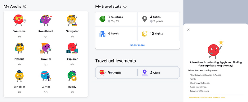
Agoda, a travel app popular in Southeast Asia, has introduced a playful badge system called "Agoji." Users earn these colorful mascots as they engage with the app.

Agoda's approach effectively combines visual appeal with user engagement. The app updates every four hours, allowing users to track their progress without overwhelming them with irrelevant information. Unlike competitors, Agoda’s badges are linked to tasks rather than simply counting streaks, encouraging users to explore the app’s features.
Section 3.1: The Need for Long-term Planning
One limitation of Agoda's system is that users can only earn a set number of Agojis. Once achieved, users may seek additional challenges, but the app lacks options for continued engagement.
Chapter 4: Recommendations for Improvement
While there is no one-size-fits-all solution for badges and streaks, certain strategies can enhance user experience:
- Integrate badges and streaks directly within the app, avoiding reliance on email notifications, which can clutter user inboxes.
- Assess the appropriateness of badges for your app's purpose; if your app encourages users to disconnect, traditional streaks may not be beneficial.
- Design badges to be fun and meaningful, allowing users to proudly display their achievements.
- Ensure badges and streaks are updated regularly, ideally within 24 hours.
- Develop badges that help users discover critical app features, enhancing retention.
- Create a roadmap for badge collection that keeps users engaged over time without overwhelming them.
Ultimately, effective badge and streak designs can motivate users to engage with an app consistently. However, if these features are not thoughtfully crafted, they can detract from the overall user experience.